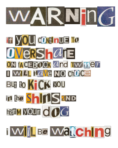
 Ask a recruiter, they have seen them. The resume from the person that thinks they are being “creative” (yes, that is an appropriate use of quotes) when they put together their resume. There are a multitude of fonts, formats, different spacing, etc… Just like on a ransom note. Not that I have every written a ransom note.
Just say no. You need to learn that formatting on a resume needs to make it EASIER to read the important information, not turn into a game of where’s Waldo. Here is a great article from Carrie Cousins at design shack about Good Writing and Editing. The same rules apply to resumes.
Here are some basic design tips:
- If you want to play it safe go with a Sans Serif font.
- Use mixed letter case the most, it reads more easily than all UPPER CASE.
- Stay consistent. If one title is upper case then make them all upper case.
- If you try to make everything stand out, nothing will.
At the end of the day remember that your resume needs to reflect the best parts of you AND you need to adapt it to each position when you apply.
Al
Design is intelligence made visible.
Alina Wheeler